Home
By Sea
By Land
Contact
Building and Outfitting
The Boats
The Bicycle
The Truck
Expedition Wherry
Rowing Boats
Building the Wherry
Truck Upgrades
People & Places
New Jersey
Bicycle Upgrades
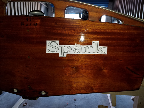
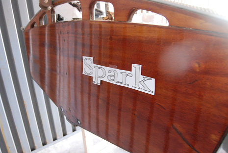
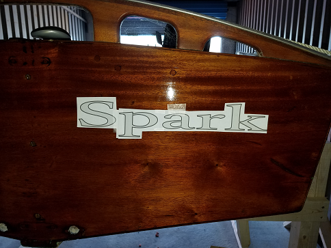
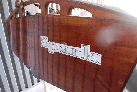
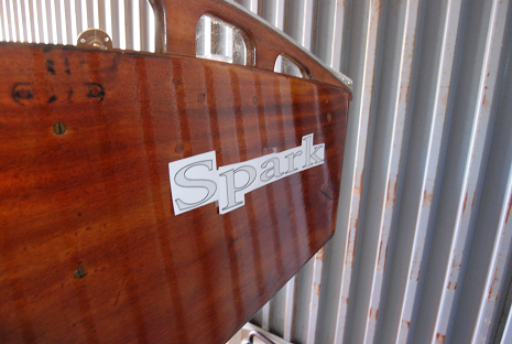
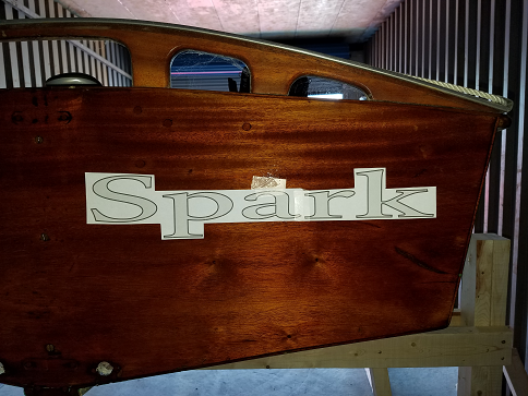
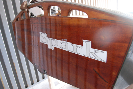
Building Spark
GP-14
Tools and outfitting
Tools
Travels through Delaware
New Jersey
Tea
Tea
Figments and Phragmites
Home
By Sea
By Land
Contact
Building and Outfitting
The Boats
The Bicycle
The Truck
Expedition Wherry
Rowing Boats
Building the Wherry
Truck Upgrades
People & Places
New Jersey
Bicycle Upgrades
Building Spark
GP-14
Tools and outfitting
Tools
Travels through Delaware
New Jersey
Tea
Tea